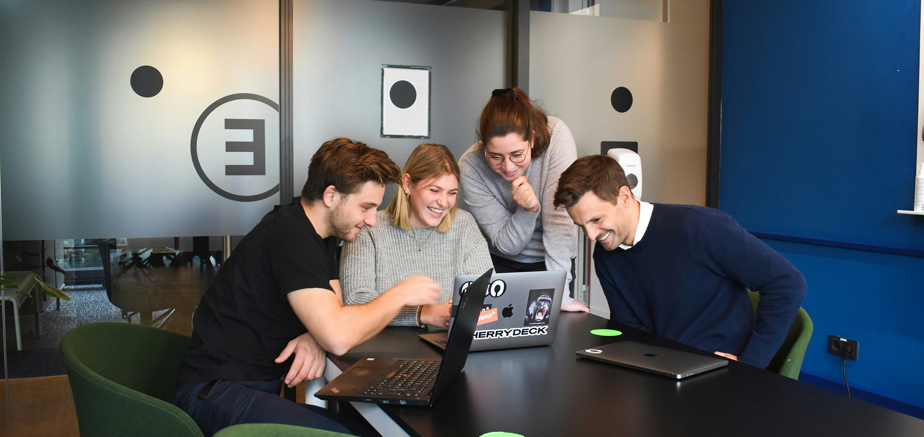
Skip to content

Kitchen Sink

A collection of styles, components and blocks to see (almost) everything in one place

Typography


Heading Font

Bricolage Grotesque

abcdefghijklmnopqrstuvwxyz

abcdefghijklmnopqrstuvwxyz

1234567890!@#$%^&*()

Body Font

Geist

abcdefghijklmnopqrstuvwxyz

abcdefghijklmnopqrstuvwxyz

1234567890!@#$%^&*()

Headings

Hero Text

Hero Text (mobile)

Desktop

Heading 1

Heading 2

Heading 3

Heading 4

Heading 5

Heading 6

Mobile

Heading 1

Heading 2

Heading 3

Heading 4

Heading 5

Heading 6

Paragraph

Lorem ipsum dolor sit amet consectetur adipisicing elit. Officia culpa deserunt ut accusantium aspernatur, architecto rerum, nam inventore laudantium omnis quae cupiditate facilis exercitationem tenetur provident eligendi autem debitis unde?

Lorem ipsum dolor sit amet consectetur adipisicing elit. Officia culpa deserunt ut accusantium aspernatur, architecto rerum, nam inventore laudantium omnis quae cupiditate facilis exercitationem tenetur provident eligendi autem debitis unde?

Lead Paragraph

Lorem ipsum dolor sit amet consectetur adipisicing elit. Officia culpa deserunt ut accusantium aspernatur, architecto rerum, nam inventore laudantium omnis quae cupiditate facilis exercitationem tenetur provident eligendi autem debitis unde?

Lorem ipsum dolor sit amet consectetur adipisicing elit. Officia culpa deserunt ut accusantium aspernatur, architecto rerum, nam inventore laudantium omnis quae cupiditate facilis exercitationem tenetur provident eligendi autem debitis unde?

Lists

  • List item
  • List item
  • List item
  • List item

Font Sizes


Font size: 20px / 1.25rem
Line height: 150%
Font size: 18px / 1.125rem
Line height: 150%
Font size: 16px / 1rem
Line height: 150%
Font size: 14px / 0.875rem
Line height: 150%
Font size: 12px / 0.75rem
Line height: 150%
Text large
Extra bold
Text medium
Extra bold
Text regular
Extra bold
Text small
Extra bold
Text tiny
Extra bold
Text large
Bold
Text medium
Bold
Text regular
Bold
Text small
Bold
Text tiny
Bold
Text large
Semi bold
Text medium
Semi bold
Text regular
Semi bold
Text small
Semi bold
Text tiny
Semi bold
Text large
Medium
Text medium
Medium
Text regular
Medium
Text small
Medium
Text tiny
Medium
Text large
Normal
Text medium
Normal
Text regular
Normal
Text small
Normal
Text tiny
Normal
Text large
Light
Text medium
Light
Text regular
Light
Text small
Light
Text tiny
Light

Fluid Typography


Headings

Fluid H1 (56px → 90px) Fluid H2 (42px → 60px) Fluid H3 (28px → 36px) Fluid H4 (20px → 30px) Fluid H5 (18px → 24px) Fluid H6 (16px → 20px)

Color Swatches

Primitive colors are the foundational building blocks of a design system's color palette.
They serve as the base for more specific design decisions.


ORANGE

#FA4E03

PINK

#FB8D9D

BLUE

#10539E

GREEN

#42B446

INDIGO

#968ABF

BEIGE

#F2A984

YELLOW

#FABC3C

GREY

#3A3A3A

BLACK

#141414

BLACK (NEUTRAL)

#000000

WHITE

#FFFBEF

WHITE (NEUTRAL)

#FFFFFF

World Colors

DEV

#FABC3C

HOSTING

#FA4E03

SEO

#968ABF

SOCIAL

#42B446

Pills


Default Style

Pill text
Orange Pill
Blue Pill
"#FF0000" Pill
"hotpink" Pill

Hollow

Black Pill
Black Neutral Pill
White Pill
White Neutral Pill
Grey Pill
Dev Pill
Hosting Pill
SEO Pill
Social Pill

Solid

Black Pill
Black Neutral Pill
White Pill
White Neutral Pill
Grey Pill
Dev Pill
Hosting Pill
SEO Pill
Social Pill

Alignment

Left/Start Pill
Center/Middle Pill
Right/End Pill

Containerless

Containerless Pill
Containerless Pill
Containerless Pill

Tables

Tables components can be used in lots of different ways, either doing a lot of stuff automatically or leaving it all down to the developer how they want to implement things

Check the code to see the major difference between these different versions


Manual

Manual table

Month Developer
January Mike View
February Nathan View
March Cameron View

Automatic (Separate data)

Separate data
Month Developer
January Mike View
February Nathan View
March Cameron View

Automatic (Combined data)

Combined data
Month Developer
January Mike View
February Nathan View
March Cameron View

Kitchen Sink

Image Hero Banner

Content

General Content

Lorem, ipsum dolor, sit amet consectetur adipisicing elit. Magnam officia culpa, veritatis quos. Quaerat impedit laudantium ex modi, magni deserunt error tempora, nulla expedita. Rem nemo nostrum harum, temporibus autem!

Lorem, ipsum dolor, sit amet consectetur adipisicing elit. Magnam officia culpa, veritatis quos. Quaerat impedit laudantium ex modi, magni deserunt error tempora, nulla expedita. Rem nemo nostrum harum, temporibus autem! Lorem, ipsum dolor, sit amet consectetur adipisicing elit. Magnam officia culpa, veritatis quos. Quaerat impedit laudantium ex modi, magni deserunt error tempora, nulla expedita. Rem nemo nostrum harum, temporibus autem!

Example Table
Month Developer Approved
December Mike Yes
December Nathan No
January Cameron No

Meet the Team

Scott Co-Owner And Technical Director
Kat Co-Owner And Client Services Director
Julaine Co-Owner And Marketing Director
Andy Head of SEO
Serena Social Media Executive
Kevin SEO Account Executive
Joshua Account Manager
Amy Account Manager
Caitlyn Client Services Executive
Franki Graphic & Website Design
Dan Lead Developer
Mike Web Developer
Cameron Web Developer
Nathan Web Developer
Tom Web Developer
Matthew Web Developer
Patrick Office, People & Culture Manager
Additional Pill

Questions

FAQs

Stacked Questions

Latest Work

3
View all
Full stack development
WordPress

Black Brick

It is a long established fact that a reader will be distracted by the readable content of a page when looking at its layout.
Animation for web
Dolor

Northcoders

It is a long established fact that a reader will be distracted by the readable content of a page when looking at its layout.
Interactive UI and UX
Laravel

RGF Staffing

It is a long established fact that a reader will be distracted by the readable content of a page when looking at its layout.

CTA

Lorem ipsum dolor sit amet consectetur adipisicing elit. Dignissimos iure quos ratione distinctio quia, obcaecati fugiat voluptates nam vel error modi eaque maxime dolorem molestias, nemo perspiciatis, itaque necessitatibus, sequi! Lorem ipsum dolor sit amet consectetur adipisicing elit. Dignissimos iure quos ratione distinctio quia, obcaecati fugiat voluptates nam vel error modi eaque maxime dolorem molestias, nemo perspiciatis, itaque necessitatibus, sequi!